
Monday, December 31, 2007
Tuesday, December 4, 2007
Surf's Up - post #12
Cody
OK, you all must be sick of Surf's Up by now, so this will be my last Surf's Up post.
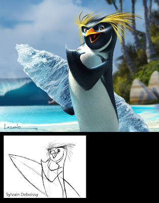
I'll end with my painting of the lead character, Cody Maverick. It's based on a drawing by our Character Designer, Sylvain Deboissy. The intent of the painting was to figure out what Cody (and all the penguin characters) would actually look like on screen.
Up until this point, we only had Sylvain's pencil drawings and marker comps, and there where a lot of questions about the penguins' finished textures. The biggest question mark was regarding feathers: should they have them or not? One concept that was gaining a lot of ground, was the idea that the penguins should look like their skin was made out of wetsuit material. Real penguins kind of look like they're wearing wetsuits anyway, and since our characters were supposed to be surfers...
The wet suit concept was intriguing, and the directors were definitely leaning in that direction. Partly because it was a fun idea, but also I think because they were afraid that a fully feathered character would look too busy on screen.
I, on the other hand, felt that when all was said and done, no matter how cool the wetsuit concept was, it would end up looking lame on screen...that anything other than a fully feathered character would just look boring...or at best, too cartoony...so I did this painting to sell the studio on what I thought Cody should look like.
In the end, this painting sold everyone on the feather idea...and the rest is history.
OK, you all must be sick of Surf's Up by now, so this will be my last Surf's Up post.
I'll end with my painting of the lead character, Cody Maverick. It's based on a drawing by our Character Designer, Sylvain Deboissy. The intent of the painting was to figure out what Cody (and all the penguin characters) would actually look like on screen.
Up until this point, we only had Sylvain's pencil drawings and marker comps, and there where a lot of questions about the penguins' finished textures. The biggest question mark was regarding feathers: should they have them or not? One concept that was gaining a lot of ground, was the idea that the penguins should look like their skin was made out of wetsuit material. Real penguins kind of look like they're wearing wetsuits anyway, and since our characters were supposed to be surfers...
The wet suit concept was intriguing, and the directors were definitely leaning in that direction. Partly because it was a fun idea, but also I think because they were afraid that a fully feathered character would look too busy on screen.
I, on the other hand, felt that when all was said and done, no matter how cool the wetsuit concept was, it would end up looking lame on screen...that anything other than a fully feathered character would just look boring...or at best, too cartoony...so I did this painting to sell the studio on what I thought Cody should look like.
In the end, this painting sold everyone on the feather idea...and the rest is history.

Thursday, November 29, 2007
Surf's Up - post #10


Surf's Up - post #8
Surfing Styles
I felt that each character should have their own personal surfing style, complete with their own distinctive board-wake...kind of like their signatures left in the water.

I felt that each character should have their own personal surfing style, complete with their own distinctive board-wake...kind of like their signatures left in the water.

Monday, November 19, 2007
Surf's Up - post #7
Last post for a while. I'm going to Hawaii for Thanksgiving to visit my cousin who just moved there. She's been trying to convince me to start an animation studio on the Big Island. I must admit, it sounds attractive. Come on, who's with me?!?!
I'll leave you with this: my painting of Chicken Joe...based on a drawing by Character Designer, Sylvain Deboissy.


I'll leave you with this: my painting of Chicken Joe...based on a drawing by Character Designer, Sylvain Deboissy.


Surf's Up - post #6
Poster Concept and Video Game Cover
I worked on 35 posters in all for Surf's Up...including all the outdoor billboards, in-theater posters, and web-based ads. I wasn't a huge fan of the posters (they weren't my concepts or layouts, and I worked more as an illustrator on them), so I'm not going to show them here.
What I will show however, is my first concept for the poster. I knew marketing would never go for anything so graphic, but I had to get it out of my system. It still think it would have made a cool t-shirt.
The logo ended up became the official film logo...but with the colors reversed.

This is the cover of the Surf's Up video game, made by Ubisoft. This one is my concept and layout, and I would love to have seen it as the actual movie poster. Oh well.
(Oh, and I can't take credit for the basic rendering of the character; it's mostly CG.)

Surf's Up - post #5
The Waves
Certainly the most memorable images in this film are the waves. When we started, there was a question as to whether or not the kind of waves we knew we were going to need were even possible to create in CG. A highly realistic, start to finish, CG animated wave, that wasn't a cheat, had never been done before in film....at least not to the level we needed. It's was kind of a Holy Grail of CG. A whole slew of folks were behind getting them up on screen. From the work that Todd Pilger and his 3D Vis Dev team did early on, to the staggering work in the final film done by the Imageworks team lead by Rob Bredow, these waves went way beyond anything we hoped we could achieve.
Check out this article on AWN for more on creating the waves.
Our job in the Art Department was to determine what the wave should look like. We did dozens of paintings of waves in all kinds of lighting and weather conditions, and from every conceivable angle. Here are a bunch of them.


Layout: Marcelo Vignali

These last three are based on photos I found on line. Don't know who the original photographers were.


Surf's Up - post #4
Pen-gu Island Beaches
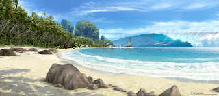
What's a surfing movie without beaches? We painted lots of beaches.
Design credit for the beaches goes to Art Director, Marcelo Vignali, and Chief Location Designer, Armand Serrano, without whom this film would not have existed. OK, it would have existed...it just wouldn't have looked as good.

Layout: Marcelo Vignali
This one was used for the billboard adds. There were characters in front of it.
Here are some color keys I did for the sequence where Cody arrives at the island. Again, compositions for these and all the color keys came from the Layout Department headed up by James Williams.

What's a surfing movie without beaches? We painted lots of beaches.
Design credit for the beaches goes to Art Director, Marcelo Vignali, and Chief Location Designer, Armand Serrano, without whom this film would not have existed. OK, it would have existed...it just wouldn't have looked as good.

Layout: Marcelo Vignali
This one was used for the billboard adds. There were characters in front of it.

Here are some color keys I did for the sequence where Cody arrives at the island. Again, compositions for these and all the color keys came from the Layout Department headed up by James Williams.


Sunday, November 18, 2007
Surf's Up - post #3
Shelly Wan asked for some color script stuff. Here you go Shelly:)
We did a LOT of color script (color key) paintings for Surf's Up...hundreds of them. We had six painters working on them for a couple years: Art Director Ron Lukas, Joty Lam, Sunny Apinchapong, Noelle Triaureau, Jerry Loveland, and myself. Ron and Joty did most of them.
For those not familiar with the process: color keys are paintings we use to design the color, lighting, mood, and overall effect of specific sequences in an animated film. This is where the "cinematography" happens, and in short, is where we determine what all the scenes will look like.
The paintings can be loose or tight, depending upon the needs of a sequence, and the number of paintings per sequence will be determined by its complexity. Some sequences require only one or two keys, while others require dozens.
In the case of Surf's Up, we used frames from the "Rough Layout" pass for composition. Once the paintings are approved, the "Lighting Department" uses them as guides for creating the color and lighting for the final 3D scenes.
(Technical note: In a 3D film, I think it works best when color keys are painted directly on top of frames from the layout department...as opposed to sketches, or storyboards...which is how it's done at some studios. More often than not, the sketches don't end up reflecting the final compositions of the scenes...making the color keys all but useless.)
Here are some color keys I did for the sequence called "Cody and Z Surf".
(For the 3rd, 4th, and 5th key, I lifted Big Z's face from a marketing painting done by Jim Salvati . Thanks Jim.)


Surf's Up - post #1
SURF'S UP
In late '03 I began working on Surf's Up, at Sony. I started off simply doing Vis Dev work, but soon was asked to take on the role of Production Designer. For the next four years, I worked with an amazing team of artists, helping to bring surfing penguins to the big screen. Sadly, the film didn't do as well as we would have liked in the box office. Happy Feet really took the wind out of our sails. Maybe I'm biased, but I still think Surf's Up is one of the best animated films to date (CG or traditional), and I feel bad for the kids who's folks didn't take them to see it...they missed out on a really great film. If you haven't seen it already...what are you waiting for?!?
The next few posts will be the work I did for the film. There's four years worth, so this may take a while.
And check out the article I wrote on the production design of the film for Animation World Network.com.
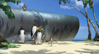
Shiverpool
These were the first two paintings I did for the film. Both are based on layout sketches by Richie Chavez, one of the best designers in the business (I need to work on him to start his own blog...you'll be blown away!)


In late '03 I began working on Surf's Up, at Sony. I started off simply doing Vis Dev work, but soon was asked to take on the role of Production Designer. For the next four years, I worked with an amazing team of artists, helping to bring surfing penguins to the big screen. Sadly, the film didn't do as well as we would have liked in the box office. Happy Feet really took the wind out of our sails. Maybe I'm biased, but I still think Surf's Up is one of the best animated films to date (CG or traditional), and I feel bad for the kids who's folks didn't take them to see it...they missed out on a really great film. If you haven't seen it already...what are you waiting for?!?
The next few posts will be the work I did for the film. There's four years worth, so this may take a while.
And check out the article I wrote on the production design of the film for Animation World Network.com.
Shiverpool
These were the first two paintings I did for the film. Both are based on layout sketches by Richie Chavez, one of the best designers in the business (I need to work on him to start his own blog...you'll be blown away!)


Tuesday, November 13, 2007
A Rare Personal Piece
I painted this waterfall for my wife, to cheer up the drab delivery room where she gave birth to our daughter. I put the painting directly in her line of sight where she could focus on it...to help bring her to a quiet, calm place, far from the agony of childbirth.
To this day she can't look at it without getting sick to her stomach.
Acrylic

To this day she can't look at it without getting sick to her stomach.
Acrylic

Sunday, November 11, 2007
Lord of the Rings: Illustrations
As promised, here are my LOTR Illustrations...or at least, the ones I don't mind people seeing.
(Note: These are all acrylic...unless otherwise noted.)
Prologue Battle: Mordor
Peter Jackson wanted to know what 600,000 troops, battling on the plains of Mordor, would look like.


Bree
The Hobits enter the town of Bree. Design for a matte Painting.

Waiting Ring Wraith
An obvious homage to Frank Frazeta. Peter was just about to shoot the Bree sequence, and he wanted an image of a Ring Wraith to show the crew, so they would have an idea of what these characters were. Unfortunately, I could never get the horse to look like anything other than a dumpy mule. Not my best painting.

Wraith World
I was assigned the task of figuring out what it would look like when Frodo put The Ring on. After several failed attempts, I finally came up with this image.
We shot 5 Wraiths in costume and full makeup, one at a time in front of a bluescreen. I then composited all of them together, removed all their color, and distorted the snot out of them in Photoshop. Lastly, I painted in lots of wispy streaky stuff, and voilà...Wraith World.

Rivendell
Alan Lee had already designed the individual Rivendell buildings...my task was to try to put them into an environment. If you're questioning the perspective in this painting (or lack thereof), the idea is that it was to represent a 180 degree pan. (Imagine the painting wrapped around your head.)

The painting works a little better if you crop in on it, and only look at small sections.


Orthank Tower (aka The Moth Shot)

Lothlorien
Once again, Alan Lee's architecture...my composition and lighting. (And for those of you who make the inevitable comparison between this, and the Ewok Village, I'll ask you to remember which story was written first.)

Now, if you compare it to the Gungin city...I might not be able to come up with a snappy comeback:)

Helms Deep

The Glittering Caves
In the story, these caves were behind Helms Deep. In fact, Helms Deep was built to guard the caves, which were filled with precious gems.
Originally in the script, Film 3 started out with a romantic scene between Aragorn (Viggo Mortensen) and Arwen (Liv Tyler) in this cave. Liv was to be swimming naked in the pool. The intent was to shoot her with lots of reflections on the surface of the water, to hide all the naughty bits. I of course designed the pool to be lit from below, thus canceling out the reflections and clearly illuminating anything that was in the water. Was that wrong of me? :)
Unfortunately, the entire sequence was cut. No, it was never shot.

Fangorn Forest
Of all the paintings I did for the LOTR films, this one is my favorite.

This was the final design for the location. It's a digital paint-over, on top of the previous painting.

Hennuth Annun Falls
Not my favorite set piece in the films. It looked like it was shot on a sound stage to me...which it was.

Mordor

Barad-Dur
This is a digital composite. The tower is a Miniature; some of the sky is a photo I took; the rest is painted.

Mt. Doom Erupting (Digital)

Elven Boat - Grey Havens

Grey Havens Sketch (Digital)

Subscribe to:
Posts (Atom)